Making a city’s services easier to navigate
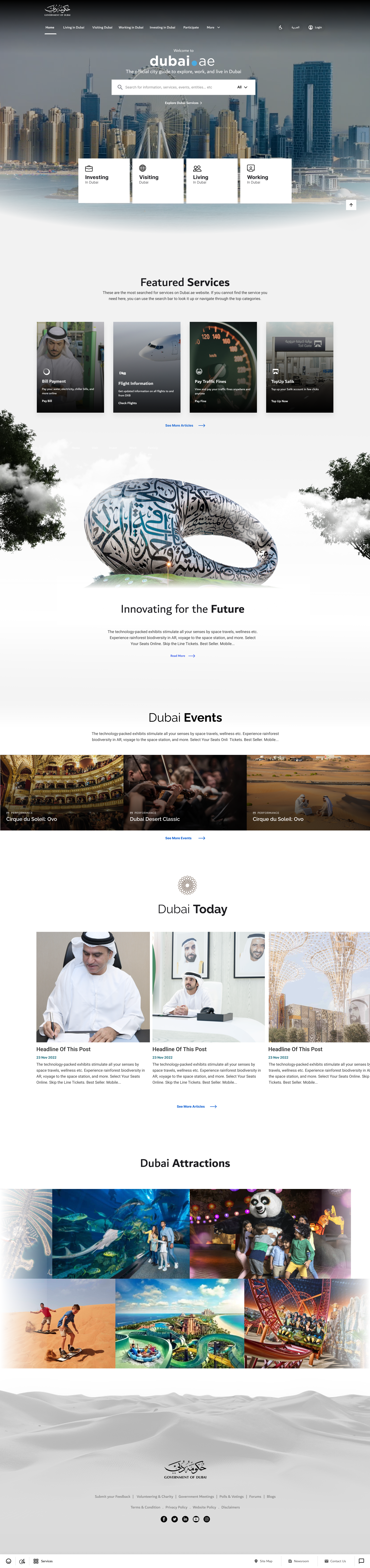
Challenge
Residents, visitors, workers and investors needed a clear starting point, but services overlapped and early visual concepts created accessibility problems.
Strategy
I facilitated service categorization with product managers and designers, then refined the homepage through five iterations around clarity and accessibility.
Results
A delivered portal with service navigation organized around Living, Visiting, Investing and Working.
- My role
- Experience research, workshop facilitation, visual and interaction design, design QA
- Scope
- Service taxonomy, homepage navigation, accessibility and developer alignment
- Period
- 2022–2024 role period
Organize around intent. Make the next step clear.
My contribution connected workshop facilitation, service architecture and five homepage iterations with accessibility and delivery constraints.
- Frame the problem
Overlapping service needs made audience categories difficult to separate.
- Align the team
I facilitated a week of card sorting with two product managers and five other designers.
- Translate into design
Four entry points informed the navigation; five iterations refined the hierarchy.
People should not need to understand government structure.
The service catalogue became the input to a shared categorization exercise, rather than the structure users had to navigate.
Discuss ambiguous categories together.
Start with what people are here to do.
Give navigation its own visual space.
Early image-heavy directions created contrast and readability problems. I used accessibility to choose the hierarchy, not simply to check the finished styling.
Letting city imagery compete with service navigation.
Separating navigation, readable content and imagery.
Explain where a category leads.
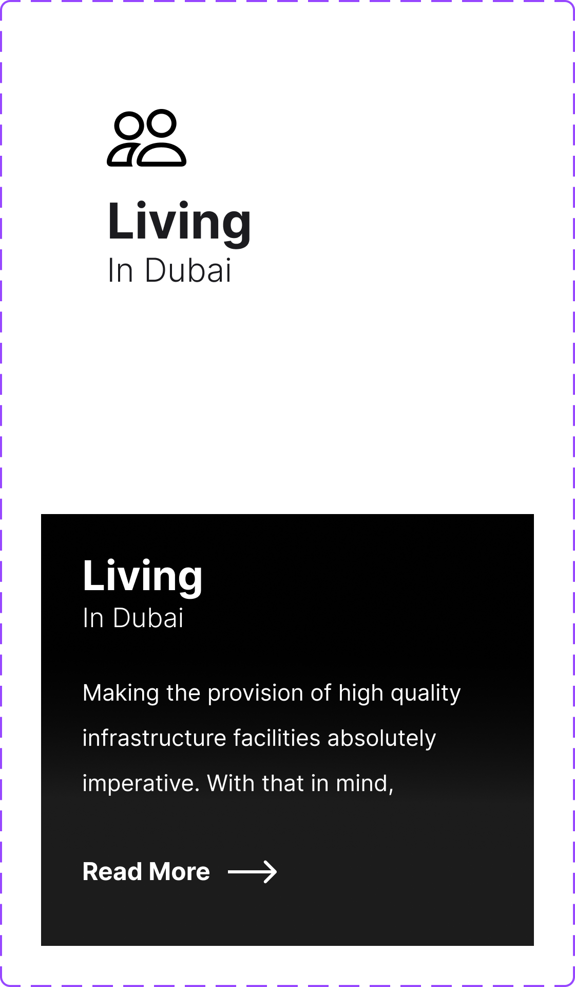
The default and hover exploration gives Living a clear identity first, then introduces more context and a next action.
- Recognize
A clear category establishes the destination.
- Explore
Additional context explains what is inside.
- Continue
A next action connects orientation to navigation.
These variants show the visual exploration. Keyboard and touch behavior are separate handoff requirements, not demonstrated production outcomes.
Results
The delivered portal brought service discovery into four clear entry points: Living, Visiting, Investing and Working. Five homepage iterations refined the balance between city imagery, navigation and accessibility.
What I carried forward
Accessibility changed the direction of the design. It became a decision criterion for the homepage rather than a final visual check.